

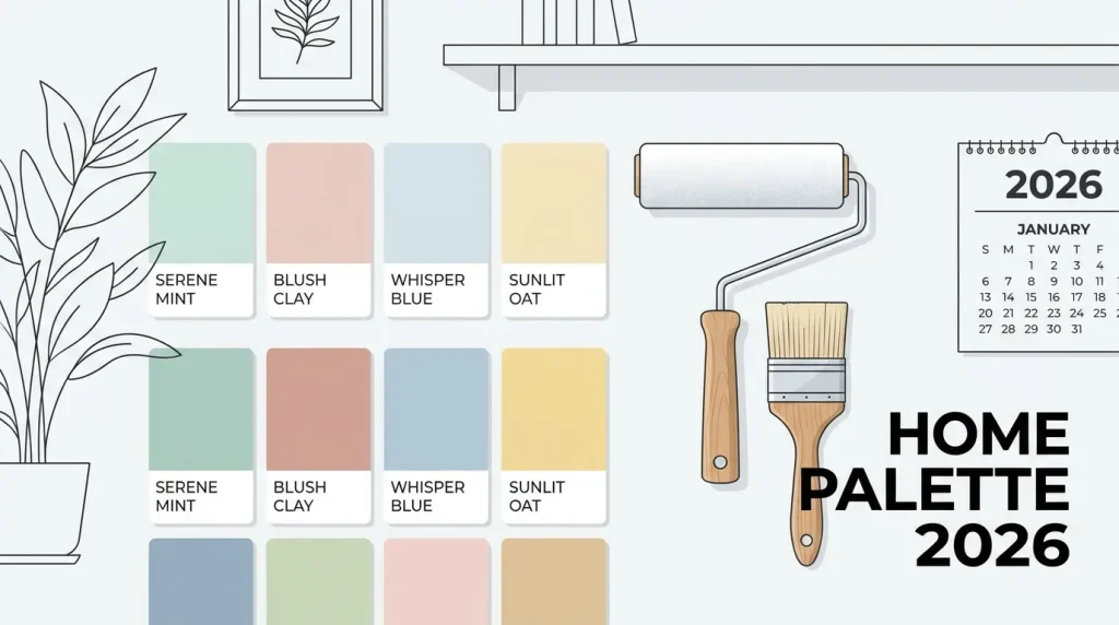
You can transform your living spaces with fresh paint. Color holds incredible power to refresh your home interior. For 2026, a fresh palette of inspiring colors sets new interior design color trends. This blog unveils the top 10 2026 paint color trends for interior walls. These paint trends offer aesthetic appeal and practical application for various residential wall paint styles.
Key Takeaways
Warm earthy tones, soft pastels, and bold jewel colors will replace cool grays in 2026.
Homeowners should test paint samples under different room lights to pick the best shades.
New painting techniques like limewash give walls unique textures and modern personal style.
Nature-Inspired Hues: Earthy and Organic Palettes
You are stepping into a new era of home design, leaving behind the cool grays of the past. The 2026 paint color trends embrace nature-inspired warm neutrals, creating inviting and grounded spaces. These color palettes feature deep walnuts, caramels, clays, and terracottas, bringing a sense of heritage and permanence to your interior. You will find these earthy palettes paired with tactile materials like unlacquered brass and organic wood grains, enhancing the connection to the natural world. Sculpted organic textures, such as plaster walls resembling bark or rugs echoing windblown grass, are everywhere, inviting touch and bringing an outdoor quality into your room.
Serene Greens and Deep Blues
Embrace tranquility and sophistication with serene greens and deep blues. Sage green, a soft muted shade, exudes calm and serenity, making it perfect for bedrooms, bathrooms, and living spaces where you desire a peaceful atmosphere. This color helps you create a tranquil backdrop for relaxation. For a touch of drama and refinement, consider navy blue. This deep, rich shade adds sophistication, making it suitable for accent walls or creating intimate, cozy environments like reading nooks. Behr’s “Hidden Gem,” a smoky jade green, offers a muted yet bold paint color that truly brings the outdoors in.
Humans respond positively to colors found in nature, such as greens and soft blues. These hues carry associations with safety, abundance, and calm, reinforcing the connection between your home and the natural landscape. Darker shades, like deep blues, absorb light, lending a sense of intimacy and coziness to larger areas. You can use these paint colors to craft spaces that feel both expansive and deeply personal, reflecting a growing trend towards biophilic design.
Warm Terracottas and Sandy Neutrals
Discover the grounding power of warm terracottas and sandy neutrals, essential elements of the 2026 paint color trends. These nature-inspired warm neutrals offer a comforting and versatile foundation for any room. You can choose earthy neutrals with clay and sand influences, like a warm terracotta-like clay color paired with sandy tan, perfect for living rooms or bedrooms. Soft warm beiges, with their subtle brown undertones, provide a crisp yet warm alternative to traditional whites, ideal for kitchens and bedrooms. Sherwin-Williams’ “Universal Khaki” is a prime example of a warm, sandy neutral paint that feels grounded and versatile, replacing cooler grays.
Terracotta, a natural material, blends seamlessly with wood and plants, making it a cornerstone of biophilic design. You can pair this rich color with sandy neutrals like cream and warm beige, along with sage green and natural wood tones, to create a harmonious environment. Adding real plants reinforces the organic feel, bringing the outdoors in. Light woods such as oak, ash, maple, and rattan work best with terracotta, maintaining a light, grounded aesthetic and preventing a heavy look. Consider “Oakwood Brown” for a truly welcoming warmth in your home.
Muted Sophistication: Soft Pastels and Desaturated Shades
You will find a gentle shift towards muted sophistication in the 2026 paint color trends. Experts forecast a rise in frosted pastels, offering refreshing alternatives to traditional neutrals. These delicate shades, including icy pastels and cloudy whites, bring a serene and versatile feel to any interior. They provide a soft backdrop, allowing other design elements to shine while maintaining a calming atmosphere.
Dusty Pinks and Lavender Grays
Embrace the subtle charm of dusty pinks and lavender grays. Sherwin Williams Pink Shadow, a muted dusty pink, acts as an elevated neutral. It offers softness without overt sweetness. You can pair this color beautifully with light woods, plaster finishes, and layered textiles. This shade is perfect for quieter spaces like bedrooms, sitting rooms, or transitional areas, creating a comforting and refined ambiance.
Consider pale lavender shades, such as Sherwin-Williams’ Lavender Wisp (LRV 66) or Benjamin Moore’s Lily Lavender (LRV 62). These behave as cool off-whites with a grayed lavender undertone. They provide restful neutrals for bedrooms and other calm spaces. These colors offer a sophisticated touch, moving beyond traditional pastels to create truly serene environments.
Subtle Yellows and Creamy Off-Whites
Discover the optimistic appeal of subtle yellows and creamy off-whites. Banana Yellow, a soft pastel, feels cheerful and calm. It signals a shift away from muted beige palettes towards more uplifting color choices. Nature-inspired yellows, like C2 Paint’s Epernay, introduce relaxed, earthy variations of yellow, bringing warmth without overwhelming your space.
Creamy off-whites remain a timeless choice, offering soft and forgiving paint options. These warm whites, with yellow, cream, or beige bases, read cozy rather than clinical. They pair naturally with wood, brass, and linen. Behr’s Swiss Coffee, Benjamin Moore’s White Dove, and Sherwin-Williams’ Alabaster are excellent examples. These versatile paint colors help you create inviting and comfortable rooms, balancing darker details and brightening shaded areas.
Bold Statements: Rich Tones and Vintage Jewel Color Palettes
You will see a shift towards bolder, more expressive color palettes in the 2026 paint color trends. These rich tones and vintage jewel colors create dramatic, immersive environments. Mark Schubert of M2 Design Lab notes, “In 2026, color palettes are moving toward richer, more expressive combinations such as merlot reds, oxblood, plum and deep teal layered with warm metals and dark wood tones. Spaces like this powder room embrace that direction by pairing saturated burgundy wallpaper with jewel-toned stone and brass accents, creating a dramatic, immersive environment.” You can achieve richness without heaviness by using muted emerald, cranberry, and deep sapphire. The key is balance: pair saturated textiles with neutral envelopes so color becomes depth, not distraction.
Deep Reds and Warm Mahoganies
You can make a powerful statement with deep reds and warm mahoganies. Glidden/PPG has named “Warm Mahogany” as their Color of the Year 2026. This rich, grounded red is bold enough to draw immediate attention. It is also reserved enough to make a timeless statement. This paint color is trending for interior walls. Glidden color experts especially recommend “Warm Mahogany” for interior walls and trim. It makes a statement as a single wall color or behind open shelving. This deep shade adds drama, but still keeps things relaxed.
You can use the power of red to give smaller spaces extra attention. A red-orange accent wall, like “Raspberry Blush 2008-30,” elevates a small kitchen. A deep red paint in a higher gloss heightens the drama. This sends a signal of color confidence. Other deep reds you will love include Benjamin Moore’s “Dinner Party AF-300,” “Raisin Torte 2083-10,” and “New London Burgundy HC-61.”
Charcoals and Rich Blues
Embrace sophistication with charcoals and rich blues. Benjamin Moore’s “Silhouette AF-655” offers a rich blend of espresso and charcoal. This versatile and classic shade is inspired by tailored suiting. James Hardie highlights “Iron Gray” as a deep, dramatic neutral. It amplifies your home’s architectural voice. These deep tones provide a strong foundation for your design.
You will find many stunning blue paint options for 2026. Behr’s “Dark Pewter” is a blue-charcoal. Sherwin-Williams’ “Cyberspace” is a blue-black. Benjamin Moore’s “Hale Navy” offers a soft blue-black. For true navy, consider Sherwin-Williams’ “Naval” or Benjamin Moore’s “Newburyport Blue.” Behr’s “Midnight Show” is a deep indigo-navy. Benjamin Moore’s “Gentleman’s Gray” is an inky blue-teal. “Van Deusen Blue” from Benjamin Moore is a mid-navy. These rich blues offer luxury and tranquility, making them perfect for creating a sophisticated atmosphere.
Modern Neutrals: Timeless Interior Paint Trends
You will discover that modern neutrals are evolving, offering timeless appeal for your home. The 2026 paint color trends show a clear shift from the stark, cool grays of previous years. You are now embracing warmer, more organic neutrals that bring depth and balance to your living spaces. These new neutral paint choices create a more livable and timeless feel, moving away from potentially sterile environments. Homeowners are actively seeking these warmer options, making them a dominant force in current interior paint trends.
Greige and Warm Gray Variations
You can confidently choose greige, as it has transitioned from a passing trend to a default neutral. This versatile color flatters wood, metals, and almost any accent color, making it a designer-recommended choice for your walls. Greige also photographs beautifully in any light, ensuring your home always looks its best. Consider Sherwin-Williams Agreeable Gray (SW 7029), a balanced green-gray that works well in any room. For a warm yellow-gray, Sherwin-Williams Accessible Beige (SW 7036) is perfect for south or west-facing rooms and open-plan layouts. Benjamin Moore Revere Pewter (HC-172) offers a green base that can sometimes flash mauve, ideal for living rooms and well-lit spaces. Behr also offers excellent greige options like Perfect Taupe (PPU18-13), which provides depth without tipping into brown, and Wheat Bread (720C-3), a soft, green-leaning greige perfect for kitchens. These warm neutrals provide a comforting backdrop for your interior design.
Deep Taupes and Sophisticated Charcoals
You will find enduring popularity in sophisticated grays and deep taupes, proving their timeless appeal in home design. These colors offer a strong foundation for your interior, allowing other elements to shine. For example, nine out of ten of the most popular paint colors are neutral (gray or white), demonstrating their lasting power. You can explore options like HGTV Home by Sherwin-Williams’ “Griffin,” a strong gray that anchors any room with its depth. These deeper shades provide a sense of grounding and elegance, making them perfect for creating a refined atmosphere. They offer a versatile color palette that complements various design styles, ensuring your home remains stylish for years to come.
Selecting the Best Residential Wall Paint Trends
You can transform your home with the right paint choices. Selecting the best residential wall paint involves more than just picking a pretty shade. You must consider how light interacts with your chosen color and the specific function of each room. This thoughtful approach ensures your interior spaces feel harmonious and inviting.
Considering Lighting and Room Function
You should always consider the unique characteristics of each room. For kitchens, you can use whites and soft grays for a clean feel. You can add accent colors like navy or sage green on islands. Living rooms benefit from warm grays, soft taupes, or rich navy with white trim. Bedrooms need serene choices like muted blues, blush tones, or earthy neutrals. Bathrooms brighten with soft aquas or crisp whites. Powder rooms allow bolder colors like charcoal or jewel tones. You can start with an inspiration piece, like a rug, to determine your anchor color. Consider undertones: warm for communal rooms and cool for private spaces.
Lighting plays a crucial role in how a color appears. North-facing rooms need warmer tones to counteract the cool light. South-facing rooms can handle cooler colors. East-facing rooms suit soft pastels. West-facing rooms intensify warm hues. Always test paint samples on your walls. Observe them at different times of day. This helps you see how natural and artificial light affects the color. For open floor plans, ensure cohesive color palettes. Rooms with doors can have more independent color choices. You can use light colors to make small rooms feel larger. Dark colors reduce a cavernous feel in high ceilings.
Application Techniques and Personalization
You can elevate your walls beyond a simple coat of paint. Emerging finishes like limewash offer unique textures and depth. These trends allow for significant personalization. For example, the “Enveloped Room” technique creates a cohesive sanctuary. You apply limewash to walls, ceiling, and trim in the same or varying tones. The “Layered Fresco” technique uses a two-tone wet-on-wet method. You apply a lighter shade over a darker base while damp. This creates mottled, cloud-like movement, mimicking ancient frescoes.
You can also achieve a “Tone-on-Tone” effect. Apply two coats of a deeper shade. Then, mix a lighter version, perhaps adding 25% white and 10–20% water. Apply this as a third paint coat using a cloud technique or random brushstrokes. Let each coat dry completely. This creates contrast and depth. For a distressed look, apply lime paint normally. Then, while the material is just setting, spray with water or wipe with a cloth. This creates an aged, worn appearance. These application trends allow you to truly make your residential wall paint unique.
You have explored the 2026 paint color trends, blending nature’s calm with bold sophistication and personal expression. Selecting the right residential wall paint transforms your home. These interior design color trends empower you. Experiment with these paint colors. Find what resonates with your interior style. Refresh your living spaces with confidence and creativity. These paint trends are for you.
FAQ
How do I choose the right paint color for my room?
You should consider lighting and room function. Test paint samples on your walls. Observe them at different times of day. This helps you see how light affects the color.
What are the main color trends for 2026?
The 2026 trends include nature-inspired hues, muted pastels, bold jewel tones, and warm modern neutrals. You will find a blend of calm and expressive palettes.
Can I use bold colors in small spaces?
Yes, you can! Bold colors give smaller spaces extra attention. A red-orange accent wall elevates a small kitchen. Deep red paint in a higher gloss heightens drama.
See Also
The Top Five BANDě Interior Paints For Your Home
Comparing Dulux And Behr To Find The Best Paint
How To Choose Ideal BANDě Outdoor Paint This Year
Create A Healthier Home With Inorganic Anion Wall Paint
Transform Your Home Walls With Master Decorative Coating Products
